Staff report mainly positive but highlights concerns about lost surface parking and the pre-existing plan to widen Main Street.
By Joey Coleman
Published July 03, 2015
Wilson-Blanchard is planning a new four-storey building at 21 Main Street West, behind the heritage-designated Bank of Montreal building which presently houses Gowlings law firm.
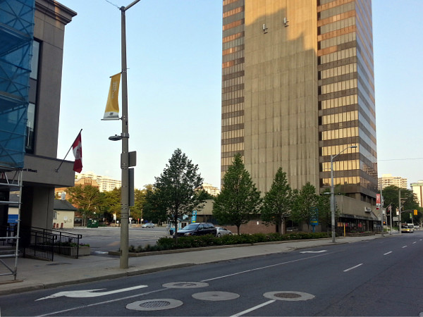
21 Main Street West (RTH file photo)
The proposed building, which will contain two floors of underground parking, will be reviewed by Hamilton's Design Review Panel on July 9 at 4pm. The meeting, in 264 of City Hall, is open to the public.
The proposal is for the first floor to be commercial retail space and the upper three floors to house offices. The vacant lot owned by Wilson-Blanchard at 20 Jackson Street West will be converted to provide surface parking for office tenants.
At present, the footprint of a former office tower on the 20 Jackson Street west lot is blocked off from parking following the demolition of the previous office building in November 2013.
Wilson-Blanchard held a pre-consultation with the City in the late spring of 2014 about a longer timeline Phase 2 development at 20 Jackson Street West to build a 19-storey condominium tower attached to a two-storey retail/office building.
Currently, the City is only reviewing Phase 1 at 21 Main West.
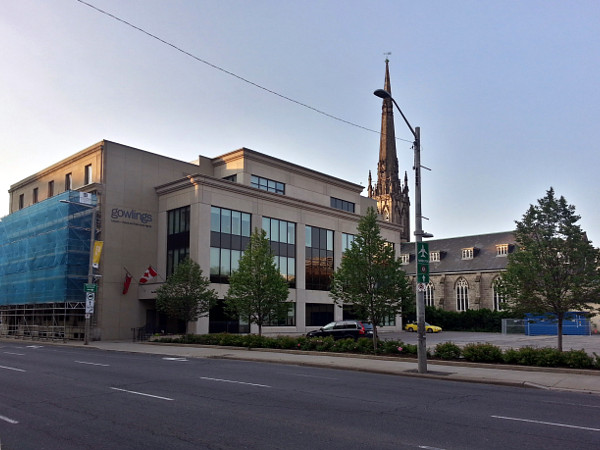
Gowlings building (left) with 21 Main Street West beside it (RTH file photo)
The Design Review Panel will look at the renderings by project architects DPAI and provide their recommendations of changes to the design plan to City staff who will consider them at a Site Plan review meeting.
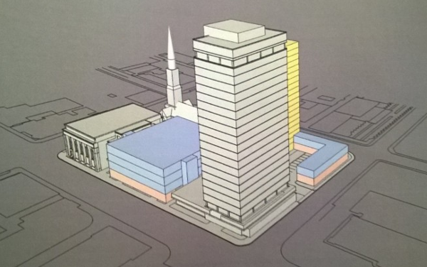
Proposed development on 21 Main Street West
The proposal does not require any zoning changes and will not be subject to a public Planning Committee hearing. Phase 2, if submitted as envisioned, will require a full Planning process.
I reviewed the full file of staff comments and most City departments are supportive of the Phase 1 proposal. In fact, many of the comments from urban planning were very positive.
There are two hurdles to the development: road widening and parking.
Officially, the City of Hamilton plans to expand Main Street from its present five lanes of one-way traffic to six lanes of one-way traffic. In keeping with this City plan, the Development Engineering division is asking for a setback of the building from Main Street.
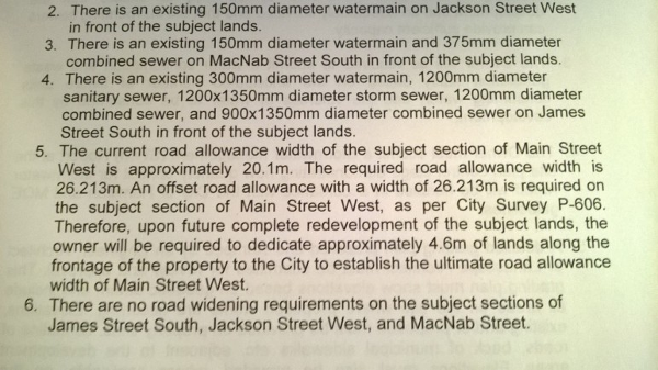
Request for setback to widen Main Street
In addition, the City is concerned that recent developments in the Downtown Core could make the City's downtown parking "crisis" worse.
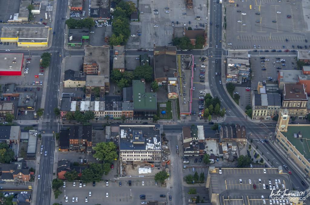
Surface parking in downtown Hamilton (Image Credit: Anita Thomas)
At present, the City of Hamilton has a large amount of surface parking in the downtown and one of the lowest parking rates in Canada. Monthly surface parking can be had in the downtown for as little as $50 per month, just over half the price of a monthly bus pass.
How bad is the crisis? At peak usage, 68 percent of parking spaces are occupied, according to the City's Downtown Parking Study. That utilization, measured in 2012, is actually down from a peak usage rate of 76 percent in 2005.

Concern about parking
The comments from Parking are odd in the context of this development, which will include twice as much parking as the current surface lot by digging two stories of underground parking!
The General Manager of Economic Development and Planning has delegated authority from Council to waive the road widening requirement for Main Street.
Comments from parking are not binding upon the process and are for the consideration of the Chief Planner.
If approvals are given, this building could be constructed in 2016.
This article was first published on The Public Record and is republished here with permission.
By Starry Hinson (anonymous) | Posted July 03, 2015 at 07:48:38 in reply to Comment 112517
I don't know if EcDev had the authority 5 years ago when Stinson was trying to do the Grand but with Tim McCabe at the helm would it have made any difference?
By NoSugarAdded (registered) | Posted July 03, 2015 at 10:59:21
Another project that fell apart because of the stupid set back rule for widening was a 15 storey Residence Inn by Marriott Hotel at Main and Walnut. The setback would have taken 20% of the building away. It made the building un-economical to build and run. They would not wave the set back so instead of getting millions of dollars in taxes they now get a few thousands from a Dollar Store. Council needs to just remove this set back rule and go on record saying that Mains Street is as wide as it will ever get.
By Setback (anonymous) | Posted July 03, 2015 at 11:36:13 in reply to Comment 112520
But but but I thought Main St is our "competitive advantage", Lloyd Ferguson said so!
By KevinLove (registered) | Posted July 03, 2015 at 13:38:19
Meanwhile, in the rest of the world…
In places that understand how to build cities, urban road space is being turned into housing and businesses. It turns out that after we remove the cars from it, there is a lot of excess space on roads that can instead be turned into something useful. For example, see:
By KevinLove (registered) | Posted July 03, 2015 at 17:46:57 in reply to Comment 112523
A quotation from the article on Jodenbreestraat I linked to
The access road to the IJ-tunnel was narrowed from 4 lanes to 2 and on the free space 350 new homes were built. The motor traffic tunnel under the traffic circle was closed in 1996 and Jodenbreestraat went from 4 lanes to 2 in the south part and only one lane in the north part of the street. The entire east side of the street was rebuilt so that the street was much narrower again and it now has shops again on ground level...
And what became of that car-tunnel? Well, that was given to Amsterdam’s children! It was turned into a huge underground playground called TunFun. Where once traffic roared, children jump on trampolines now!
And don't forget to watch the video!
Comment edited by KevinLove on 2015-07-03 17:48:45
By Dylan (registered) | Posted July 03, 2015 at 17:50:34
Wait, they want to WIDEN Main?! Why? Haha. What remotely necessitates that? It's been down to four lanes though the core for years now with construction and it still runs pretty smoothly even in rush hour. And the sidewalks are already dangerously narrow for the high speed traffic that whips through the downtown.
By jason (registered) | Posted July 03, 2015 at 21:53:55 in reply to Comment 112528
20- minute city, baby. It's catchier than 'The Ambitious City'
By DowntownInHamilton (registered) | Posted July 04, 2015 at 00:32:09 in reply to Comment 112529
By Fred Street (anonymous) | Posted July 04, 2015 at 09:36:25
Hilarious that offices on Gowlings' west face could soon have neighbours at arms' length.
That hall-of-mirrors effect will presumably be approximated when a architectural proposal is brought before the design review panel by an advocate for and member of both.
thespec.com/news-story/2126137-five-questions-with-award-winning-hamilton-architect-david-premi/
cbc.ca/news/canada/hamilton/news/hamilton-to-get-architectural-watchdog-1.1355460
hamilton.ca/develop-property/policies-guidelines/design-review-panel
Excited to hear what the DRP thinks of what looks to be a flat-packed stack of blandness.
By Fred Street (anonymous) | Posted July 04, 2015 at 09:37:31 in reply to Comment 112536
thespec.com/news-story/4512095-the-battle-to-banish-bad-buildings-from-hamilton/
By KevinLove (registered) | Posted July 04, 2015 at 09:44:05
Here is another example, with video, from the city of s'Hertogenbosch. See:
https://bicycledutch.wordpress.com/2013/...
From the above link:
What was a four lane road with separated cycle lanes just six months ago, is now a street with only two lanes for motor traffic (one for each direction) and completely protected cycle paths right next to it. The Dutch are currently downgrading many of their streets in a somewhat similar way as the US ‘road diet,' but why?
Two weeks ago I showed you how Utrecht cut residential streets that were built very wide in the 1960s exactly in half, to comply with today’s policies of traffic safety and to make the streets more attractive for people to live in.
Comment edited by KevinLove on 2015-07-04 09:45:25
By jason (registered) | Posted July 04, 2015 at 22:20:00 in reply to Comment 112536
Not sure if these are the current renderings or not, but on their instagram page there are 3 versions. I LOVE this 1st version, and would be happy with any of the 3. Exactly what modern architecture should do - face the street and be modern. Not faux heritage.
By Robert D (anonymous) | Posted July 06, 2015 at 16:17:50
Is anyone else confused by the fact that this building needs to be set back to accommodate potential widening, but the buildings immediately east and west are both built to the sidewalk more or less, with no setback?
You must be logged in to comment.
There are no upcoming events right now.
Why not post one?