The lesson for King Street West is to follow the lead of architect Bruce Kuwabara, who managed to transform an ugly fortress into a warm, inviting gallery, and open the facilities to the street.
By Ryan McGreal
Published May 31, 2005
The strip of King Street West from James Street to Bay Street sucks.
Flanked on either side by the blank walls of Jackson Square and what may be the ugliest tower in Hamilton (the Ellen Fairclough Building), marred by a dilapidated pedestrian overpass, and tormented by the relentless high-speed drone of one-way traffic, the long block that passes for Hamilton's financial district exhibits contempt for pedestrians.
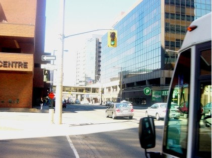
Pedestrian's view of a downtown block apparently built with Duplo
Yes, the newly renovated Art Gallery of Hamilton is a big step in the right direction, not least because its entrance has been moved to King Street from the crypt-like Summers Lane. However, most of the block is still fairly inhospitable.
The block's facilities, however "world class" some may be, hide from the street, buried under subterranean lanes or locked away in malls and towers. The shabby elevated walkway and desolate Jackson Square Plaza represent a failed idea in urban planning: it turns out people don't actually want to escape the streets after all.
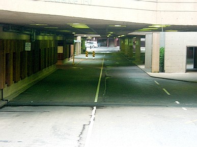
Tales from the Crypt: personal defence instructors warn people to stay away from places like this
All is not lost, however. The King West mega-complex does have some things going for it, and the AGH renovation demonstrates that a clear-minded architect can retrofit even the most horrible architecture. Features include:
This all makes for a fairly robust "catchment basin" to feed the neighbourhood, if only King West itself weren't so hostile to people. With a mix of uses that draws people during both day and evening, this block could be great for local businesses.
Fixing it up will go a long way toward integrating the various downtown neighbourhoods that are currently struggling against significant odds to pull themselves together, but we need to emphasize what works and ameliorate what doesn't.
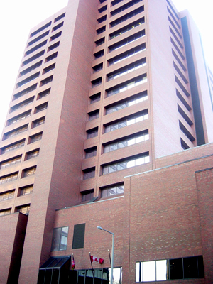
The Ellen Fairclough Building: quite possibly the ugliest tower in Hamilton
The lesson is to follow the lead of architect Bruce Kuwabara, who managed to transform an ugly fortress into a warm, inviting gallery, and open the facilities of King West to the street. The following steps might help.
The outer walls of Jackson Square need to be opened up and made permeable so that people can see and find the shops within. Every store that abuts an outer wall, especially natural street denizens like restaurants and cafes, should have a street-level presence and an entrance.
Malls are rationalized systems in the service of corporate tenants. They are designed to funnel visitors inside through limited access points and along preordained paths so they can be subjected to the kind of social engineering that encourages consumption. While some systems should be rationalized to optimize efficiency, I would respectfully suggest that urban neighbourhoods are more complex than mere corridors between point A and point B and serve public needs beyond mere consuption.
Urban spaces are defined by density and proximity of multifarious destinations with direct access from anywhere to anywhere else. This implies a lot of what engineers might call redundancy - i.e. freedom and variety for visitors. The enclosed mall, therefore, undermines the very point of urbanity.
Just get rid of it. It's an eyesore, it obstructs the AGH, it serves no purpose an intersection cannot serve, and it leads from nowhere to nowhere.
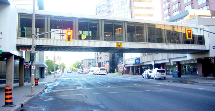
A failed idea in uban planning: this rusty, dishevelled pedestrian overpass has no business hovering over a downton street.
The many benefits of two-way streets far outweigh any inconvenience to drivers. Pedestrians can walk more comfortably and cross more safely; cyclists can share the road and keep up with traffic; and people sitting on patios can hear each other and enjoy the experience. As long as King Street remains one-way, many people will simply avoid it. The city has to move more quickly on this no-brainer.
I don't know whether this can take place without another $20 milllion renovation, but these facilities can't remain hidden and expect to attract many visitors. They should be on proud display like the AGH. Perhaps the city can discuss options with Mr. Kuwabara.
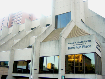
It's past time to abandon the siege mentality in Hamilton's "world class" auditorium and convention centre.
If Jackson Square Plaza was intended to serve as a public square, its designers clearly had no idea how or why public squares work. The Plaza offers nothing by way of intrinsic attractions and enjoys little to-and-fro traffic, since most destinations are reached more easily via the streets or mall corridors. It is usually populated, if at all, by bored teens and smokers from adjacent offices. People won't go here without good reason.
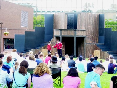
About 100 students enjoy Hamilton Urban Theatre's production of Romeo and Juliet
This week, the Hamilton Urban Theatre (urbantheatre@lycos.com) is presenting Romeo and Juliet on the Plaza, with a production of Much Ado About Nothing planned for July 8 to 30. The space is actually quite amenable to plays and concerts, but so few such events are planned that most people don't think of looking there.
However, as the surrounding area becomes more attractive and more people come downtown, a busy summer roster of rooftop performances could simultaneously draw up existing people and attract still more people.
Jason Leach wrote about this in depth already, so I direct you to his compelling plea for a people-friendly core. This can only help to draw more people downtown.
Tempting as it may be simply to demolish the whole mess and start from scratch, that kind of thinking is exactly what gave us this Brutalist mega-complex in the first place. Bruce Kuwabara demonstrated that it is possible to retrofit existing facilities to make them friendlier; we need to take our cue from his example.
No building is perfect, and no architectural style is going to please everyone. However, the basic premise of city building - vibrant streets, porous walls, distinct presence - works because it serves human needs, not the egos of politicians and designers. Rather than wringing our hands endlessly about the lost Victorian buildings, we need to find ways to make our existing buildings work for us.
You must be logged in to comment.
There are no upcoming events right now.
Why not post one?