When you plot Ontario's debt on an inflation-adjusted, per-capita basis, the picture is not nearly as stark as you might expect.
By Ryan McGreal
Published May 29, 2019
What if the Liberals weren't nearly as disastrous for Ontario's deficits and debt as everyone seems to think?
Please bear with me for a few moments. I know we hear a lot about how much the debt grew under the Liberals' long 15-year government. Here's a chart of Ontario's nominal debt from 1995 to 2019:
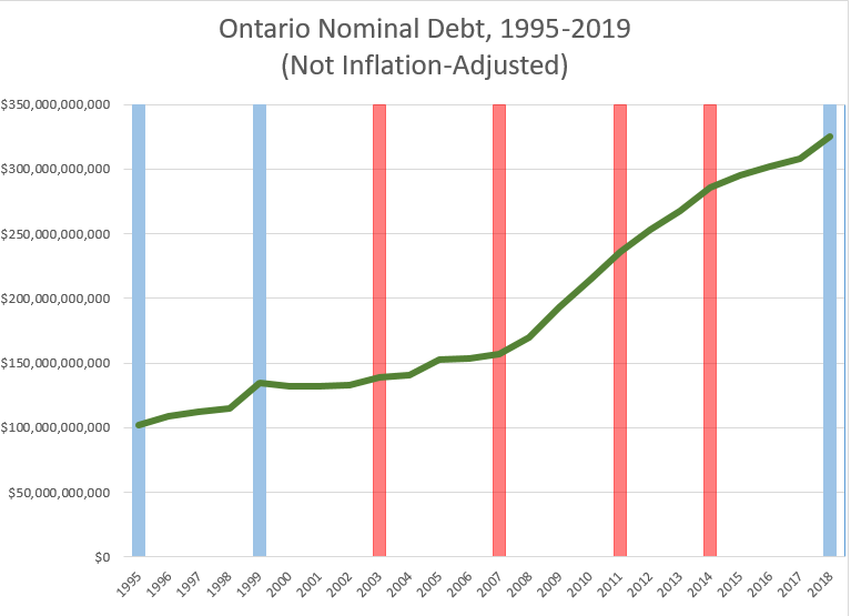
Chart: Ontario Nominal Debt, 1995-2019 (Not Inflation Adjusted)
The green line is the debt by year, and the vertical lines represent provincial elections. The blue lines represent elections won by the Progressive Conservative Party and the red lines represent elections won by the Liberal Party.
But we need to make sure we're comparing apples to apples. As I've argued in the past, we need to put the debt in context by looking at it on a per-capita basis.
After all, Ontario has big numbers in part because we're a big province, with 15 million residents making up 40 percent of the total population of Canada.
If we take the same Ontario debt numbers by year and plot them on a per-capita basis, the chart starts to look less frightening.
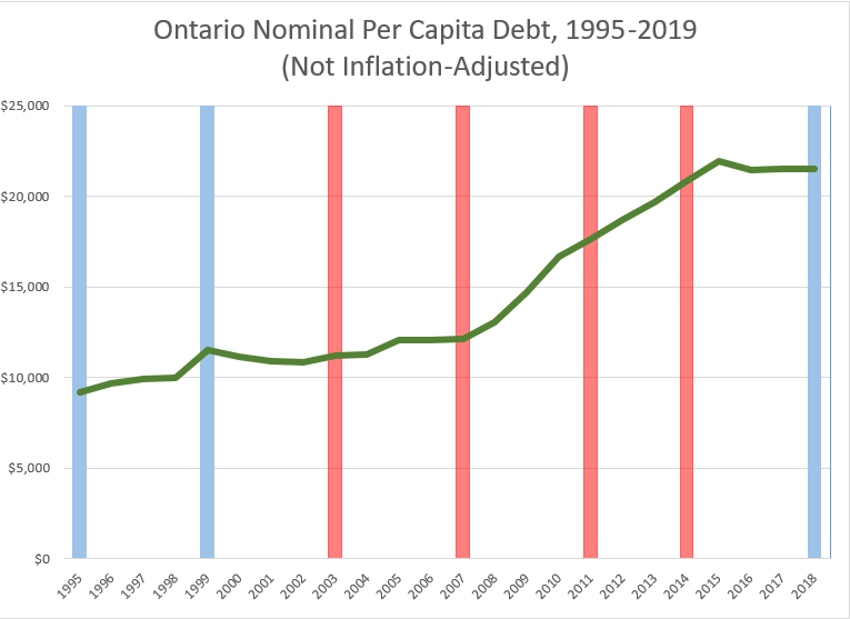
Chart: Ontario Nominal Per Capita Debt, 1995-2019 (Not Inflation Adjusted)
But we're looking over a period of 25 years, and a 1995 dollar is not worth the same as a 2019 dollar. So we also need to adjust the debt for inflation. Here is the same chart, inflation-adjusted so every amount is expressed in 2019 dollars:
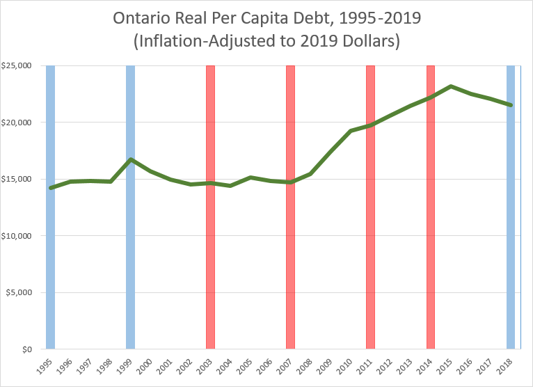
Chart: Onario Real Per Capita Debt, 1995-2019 (Inflation-Adjusted to 2019 Dollars)
It turns out that when you plot Ontario's debt on an inflation-adjusted, per-capita basis, the picture is not nearly as stark as you might expect.
Some observations:
The real per capita debt increased under the first Harris term from 1995-1999, even though this was a period of strong economic growth and the government infamously slashed its way through public expenditures.
Under the second Harris/Eves term from 1999-2003, the debt declined slightly and then flattened, during a time when the government was trying to course-correct from its first-term unsustainable cuts by backfilling some public spending.
Under the first McGuinty term from 2003-2007, the debt remained pretty flat during a time when public investment recovered significantly and many of the Liberals' best (and worst) legacy projects debuted.
The debt increased significantly during the second McGuinty term from 2007-2011, driven by public spending to cushion the Great Recession, which is widely regarded as the worst economic crash since the Great Depression of the 1930s. One would expect the debt to increase during this period.
The debt continued to increase under the minority McGuinty/Wynne term from 2011-2014, albeit at a lower rate than the previous term as the global economy very slowly slid out of recession into a famously anemic, slow-growth recovery.
The debt peaked in 2015, early in the Wynne term from 2014-2018, and then started a trend of declining again from 2015-2018.
Wait, what? That can't possibly be correct! All we've heard over the past five years was about Wynne's "out of control spending". But it is correct. The Liberals spent the last three years of their long run bringing the real per-capita debt down.
I don't know why the Liberals didn't do a better job of highlighting this fact. Perhaps there was no point rowing against the prevailing narrative, or perhaps they thought it undercut Wynne's positioning as a compassionate left-wing Liberal.
Nevertheless, a reasonable person looking clearly at the facts can conclude that the Liberals ran up the debt when they had to - during the worst recession in almost a century - and began the hard job of bringing it down in the recovery.
At the same time, the Wynne Government finally began nudging OW/ODSP rates back toward a living minimum after two decades of cuts and stagnation. They also raised the minimum wage, launched a Basic Income pilot, established a carbon pricing cap and trade market, established universal pharmacare coverage for children up to age 24, provided free postsecondary tuition for low-income students, and invested heavily in the first new rapid transit expansion in a generation.
And remember: they did this while collecting the lowest per capita public revenue among Canadian provinces, leaving them very little room to maneouvre. So much for the right-wing narrative that Liberals aren't good with money.
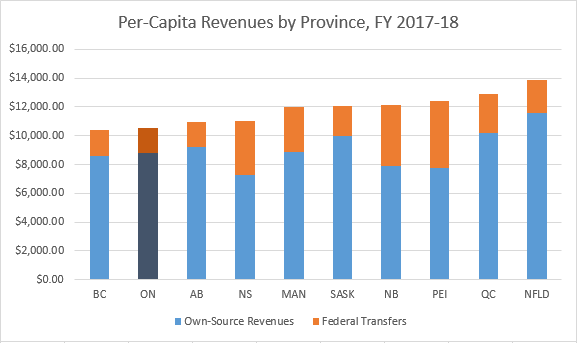
Chart: Provincial Per-Capita Revenues, FY 2017-18
Meanwhile, the new Ford government has just managed the curious feat of significantly increasing the total budget while simultaneously imposing a broad swath of savage cuts to education, health care, housing and support for the most vulnerable residents.
Take another look at the chart of real, per-capita debt from 1995 to 2019.

Chart: Onario Real Per Capita Debt, 1995-2019 (Inflation-Adjusted to 2019 Dollars)
Observe how the line moves over that course of years. Ask yourself if this is the trend of a government stuck in out-of-control spending and on the verge of bankruptcy.
Say what you want about the Liberals, but notwithstanding some high-profile gaffes and scandals, they traced a pathway through an eventful 15 years of global economics that a reasonable person should be able to understand, whether or not you agree with everything they did.
So the next time a Conservative runs around screaming that the sky is falling, remember that you are being lied to and don't believe the scaremongering.
| Fiscal Year | Nominal Debt | Population | Nominal Per Capita Debt | Inflation Rate | Real Debt | Real Per Capita Debt |
|---|---|---|---|---|---|---|
| 1995-1996 | $101,900,000,000 | 11,080,000 | $9,197 | 54.61% | $157,547,590,000 | $14,219 |
| 1996-1997 | $108,800,000,000 | 11,230,000 | $9,688 | 52.15% | $165,539,200,000 | $14,741 |
| 1997-1998 | $112,700,000,000 | 11,370,000 | $9,912 | 49.44% | $168,418,880,000 | $14,813 |
| 1998-1999 | $114,700,000,000 | 11,500,000 | $9,974 | 48.12% | $169,893,640,000 | $14,773 |
| 1999-2000 | $134,400,000,000 | 11,680,000 | $11,507 | 45.24% | $195,202,560,000 | $16,713 |
| 2000-2001 | $132,500,000,000 | 11,900,000 | $11,134 | 41.11% | $186,970,750,000 | $15,712 |
| 2001-2002 | $132,100,000,000 | 12,090,000 | $10,926 | 36.94% | $180,897,740,000 | $14,963 |
| 2002-2003 | $132,600,000,000 | 12,250,000 | $10,824 | 34.20% | $177,949,200,000 | $14,526 |
| 2003-2004 | $138,800,000,000 | 12,390,000 | $11,203 | 30.67% | $181,369,960,000 | $14,638 |
| 2004-2005 | $140,900,000,000 | 12,530,000 | $11,245 | 28.30% | $180,774,700,000 | $14,427 |
| 2005-2006 | $152,700,000,000 | 12,660,000 | $12,062 | 25.54% | $191,699,580,000 | $15,142 |
| 2006-2007 | $153,700,000,000 | 12,760,000 | $12,045 | 23.35% | $189,588,950,000 | $14,858 |
| 2007-2008 | $156,600,000,000 | 12,880,000 | $12,158 | 21.12% | $189,673,920,000 | $14,726 |
| 2008-2009 | $169,600,000,000 | 13,000,000 | $13,046 | 18.45% | $200,891,200,000 | $15,453 |
| 2009-2010 | $193,600,000,000 | 13,140,000 | $14,734 | 18.03% | $228,506,080,000 | $17,390 |
| 2010-2011 | $214,500,000,000 | 12,850,000 | $16,693 | 15.19% | $247,082,550,000 | $19,228 |
| 2011-2012 | $236,200,000,000 | 13,390,000 | $17,640 | 11.74% | $263,929,880,000 | $19,711 |
| 2012-2013 | $252,800,000,000 | 13,510,000 | $18,712 | 10.18% | $278,535,040,000 | $20,617 |
| 2013-2014 | $268,000,000,000 | 13,620,000 | $19,677 | 9.11% | $292,414,800,000 | $21,470 |
| 2014-2015 | $285,400,000,000 | 13,710,000 | $20,817 | 6.59% | $304,207,860,000 | $22,189 |
| 2015-2016 | $295,400,000,000 | 13,450,000 | $21,963 | 5.34% | $311,174,360,000 | $23,136 |
| 2016-2017 | $301,600,000,000 | 14,070,000 | $21,436 | 4.84% | $316,197,440,000 | $22,473 |
| 2017-2018 | $308,200,000,000 | 14,320,000 | $21,522 | 2.60% | $316,213,200,000 | $22,082 |
| 2018-2019 | $325,000,000,000 | 15,088,000 | $21,540 | 0.00% | $325,000,000,000 | $21,540 |
By mdrejhon (registered) - website | Posted May 30, 2019 at 13:55:36
For people who are too rushed, here's some helpful info:
TL;DR: Ontario's debt fell over the last few years, on a per-capita basis.
Now go read the article above!
You must be logged in to comment.
There are no upcoming events right now.
Why not post one?