If I asked you to think of groups of people to whom walkability and accessible buildings matter a great deal, you'd probably come up with something like this list: children, elderly people, pregnant women, people who use gait aids or wheelchairs, people who are physically frail.
That is, people who tend to use the services provided at an institution like St. Joseph's Hospital.
Given that St. Joe's is located on our city's main north-south street (James South) and is within easy walking distance of our main east-west streets (King and Main) and our local and regional transit hubs (HSR MacNab Terminal and Hamilton GO Centre), one would think that City Hall would have prioritized walkability in the area around the hospital.
Instead, the city has done this:
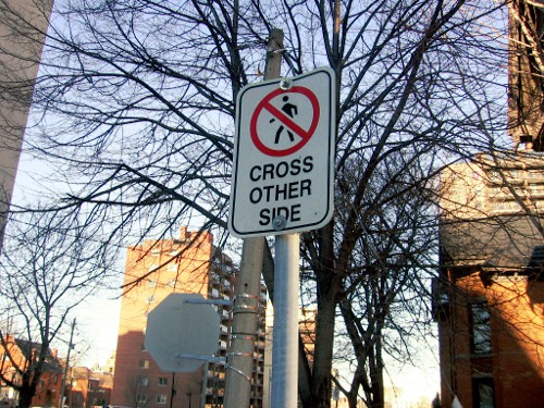
'Pedestrians Cross Other Side' sign on the east side of Hughson at Charlton
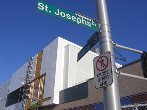
'Pedestrians Cross Other Side' sign on the north side of St. Joseph's Drive at James
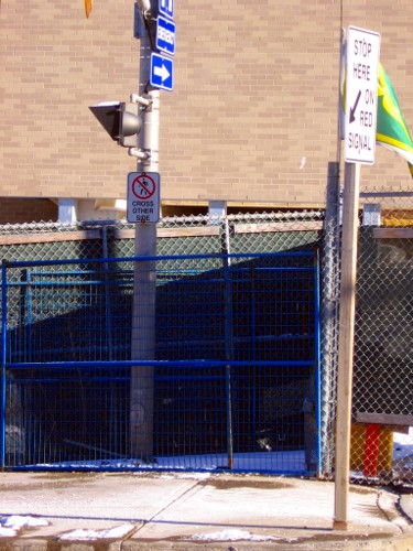
'Pedestrians Cross Other Side' sign on the south side of Herkimer at James
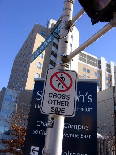
'Pedestrians Cross Other Side' sign on the south side of Charlton at James
The last of these signs is juxtaposed against the following banners to the east:
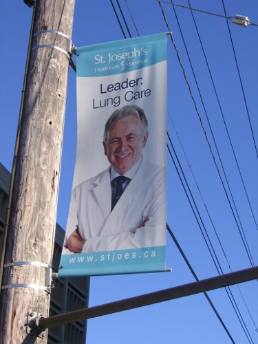
Leader: Lung Care
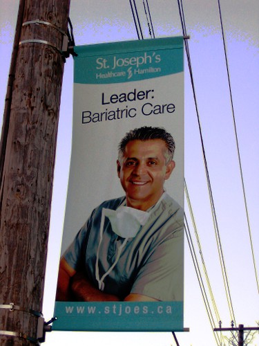
Leader: Bariatric Care
Memo to City Hall: we might need less leadership in pulmonary medicine and bariatric surgery if we hadn't designed our entire city around the personal automobile.
On a more concrete note, the closest HSR stop to SJH on the 8 Aberdeen route is at the southeast corner of MacNab and Charlton. Because pedestrians can't cross James on the south side of Charlton, they either have to cross Charlton twice or walk up the hill to Herkimer in order to get to the hospital.
Again, this isn't a big obstacle to a young adult with no mobility restrictions, but it is a very significant barrier to a lot of people who might need to get to St. Joe's for one reason or another.
Presumably the city would argue that since pedestrians are obeying the signage, there is no demand for pedestrian crossings at these intersections.
By jason (registered) | Posted June 07, 2011 at 10:15:04
Great post. I was at that area the other day and paid a lot of attention to my surroundings due to the recent death that occurred there. When I left I could only shake my head at all the commentary on RTH and other sites by (presumably) people who live in Hamilton arguing that those intersections are wonderfully designed for pedestrians and calm traffic flow. It's a total nightmare, and among some of the worst engineering you'll ever see. And that's saying something in a city with the 5 lane Main/403 ramp mess and countless other crazy feats of engineering that deserve to be in some world hall of shame.
May I boldly suggest that we fire every engineer on staff who has had a hand in designing stuff like this, and instead allow a volunteer committee of citizens design our transportation network. The result would be a simple, straightforward, easy to navigate road/sidewalk/transit/cycling system that makes sense and is safe. Why? Because I've come to the conclusion that citizens who live, walk, drive and work in the city 365 days a year with their loved ones care more about safety than anyone else.
Plus, the lack of 'formal training' (leading to crazy overdesigning) means we'd get streets designed like this:
http://upload.wikimedia.org/wikipedia/co...
Instead of this:
By Nord Blanc (anonymous) | Posted June 07, 2011 at 10:46:19
Charlton is one lane each way from Wellington to Catharine, taking on an extra westbound lane as it approaches the John South intersection. Those two lanes continue through to Hughson, though it’s practically one because of curbside parking. At Hughson, Charlton widens to three lanes in advance of the James South intersection, in order to allow for smooth traffic flow in to the north, south and west. There may only ever be a certain amount of potential for traffic calming on this stretch because of the proximity to the escarpment – John/Charlton is 180m from the Arkledun elbow and the turning lane comes up faster than that, which may increase the perceived value in having traffic exit the northbound lanes of John rather than backing up the Jolley Cut.
And then there's the basic problem: Having a hospital wedged between two busy mountain accesses means that there will almost inevitably be design issues.
By Nord Blanc (anonymous) | Posted June 08, 2011 at 08:17:53 in reply to Comment 64664
On a not-unrelated related note, does anyone recall what the pedestrian signage in this neighbourhood was like prior to 2005?
By mrgrande (registered) | Posted June 07, 2011 at 12:13:11
Memo to City Hall: we might need less leadership in pulmonary medicine and bariatric surgery if we hadn't designed our entire city around the personal automobile.
That's a bit of a stretch.
By John Neary (registered) | Posted June 08, 2011 at 15:06:20 in reply to Comment 64672
I disagree. There is strong evidence in the medical literature that exposure to automobile traffic leads to a substantial increase in the risk of respiratory diseases. There is also strong evidence that a sedentary lifestyle is a major risk factor for obesity.
Not to say that we wouldn't need respirologists and bariatric surgeons if our city were less car-centric -- just that we'd need fewer of them.
By seancb (registered) - website | Posted June 07, 2011 at 19:53:00 in reply to Comment 64672
But still funny
By Nord Blanc (anonymous) | Posted June 08, 2011 at 08:32:49
Thanks for pointing all of this out, BTW. I had noticed this before but always assumed that the eastern crosswalk anomaly at Charlton/Hughson was instituted to accommodate easy access to St. Joe's premium parking lot and was a residual artifact of the hospital's planning, while the southern crosswalk anomaly at Charlton/James I imagine relates to the prevalence of turns toward the mountain access and/or ambulance access to the hospital's emergency bay. Is it possible that the hospital has colluded in/called for these changes?
By John Neary (registered) | Posted June 08, 2011 at 15:16:56 in reply to Comment 64703
I don't know whether the hospital had any input into the city's decisions concerning these intersections. I wouldn't expect ambulance access to be much of a factor; they just use their sirens when they're really in a hurry.
The strangest pedestrian restriction of the group, in my mind, is Herkimer and James. The others can all be rationalized as improving automobile flow between James and John just below the mountain accesses. But the restriction at Herkimer and James only benefits motorists turning south onto James from Herkimer. Herkimer is a one-way eastbound street that ends at James and doesn't intersect any other major street except Queen.
I guess the ban on pedestrian crossings there makes 403-Aberdeen-Queen-Herkimer-James a quick route to the mountain brow. One would think that the Linc would have obviated the need for such a crosstown route. Another example of how, at least in Hamilton, highway megaprojects don't actually end up calming traffic on city streets.
By TreyS (registered) | Posted June 11, 2011 at 20:20:10
This has to be the best Walkability Fail ever. Thanks John. It's almost too difficult to put into words this intersection, you just have to try and walk it.
Self-guided tour; walk from the corner of Herkimer and McNab to the Font Bonne building... and you'll see.
By Nord Blanc (anonymous) | Posted June 13, 2011 at 15:05:26
One would expect St. Joe’s/HHS to have some influence on the design of their facilities. The fact that this is a place that has prominently placed garages on two faces and does its best to thrwart pedestrian access suggests to me that this hospital isn't thinking in the highest Hippocratic terms. Or maybe they're just overly proud of their structure on the NE corner of James and Charlton and anticipate substantial foot traffic from tourists.
Or maybe it's just inspiration to transfer to a more holistic lower-city facility... like Hamilton General.
You must be logged in to comment.
There are no upcoming events right now.
Why not post one?