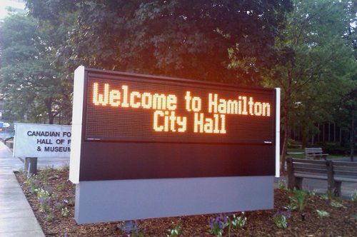
An astute RTH reader recently alerted me to an interesting feature about the new LED sign in front of City Hall.

Welcome to City Hall, sign in front of 71 Main St. W.
Like the famous Art Gallery of Hamilton sign that overhangs King Street a block away, the City Hall LED sign is only viewable from one direction:
![[crickets chirping] [crickets chirping]](/static/images/city_hall_led_sign_east.jpg)
[crickets chirping]
This is as good a symbol as any of the city's unrelenting dedication to traffic flow at the expense of all else.
By Robert D (anonymous) | Posted July 16, 2010 at 10:00:33
What I always notice about that sign is that it completely obscures the Canadian Football Hall of Fame sign. Talk about being good neighbours, eh?
By nobrainer (registered) | Posted July 16, 2010 at 10:02:27
What, you're not eager to learn more about the Canadian Fo Hall of F?
By trevorlikesbikes (registered) - website | Posted July 16, 2010 at 10:53:58
i'd like to see the attendence records for the Canadian Football hall of Dustmites and crickets. At least neither of these two signs have fallen over....yet.
By highwater (registered) | Posted July 16, 2010 at 11:15:32
They're leaving the other side blank for the Country Style Donuts sign.
By arienc (registered) | Posted July 16, 2010 at 11:31:35
Wow.
I distinctly find this non-funny.
Your city blatantly declares that only people in cars are worth welcoming.
People walking on the sidewalk who may be headed the other direction...have no value to your civic leaders whatsoever.
It's no wonder Council is so willing to cave to move the stadium out of the harbour location. They can't concieve of any perspective other than from behind the wheel of an automobile.
Comment edited by arienc on 2010-07-16 10:32:27
Kuh-lass-y.
What? Couldn't they get one of those nice ones on wheels with the day-glo letters and wire mesh?
I noticed this earlier, but at the risk of seeming too critical decided to let it slide.
Well, no more. It sucks. And it's really frustrating.
By Michelle Martin (registered) - website | Posted July 17, 2010 at 10:11:50
Naw, it fits-- we do everything bass-ackwards here.
By J (registered) | Posted July 17, 2010 at 13:53:28
Weclome to? That would imply the car stopping at City Hall..... should more accurately read "Thank you for speeding past Hamilton's NEW City Hall.... we hope you catch your next green light!"
JM
By g. (anonymous) | Posted July 19, 2010 at 13:56:31
i was just there and i love the fact that they couldn't save the marble but they chose to not replace the historic concrete steps and pavers leading up to the entrance that are severely worn. seriously? this one detail makes everything look shoddy. with all the money they spent would another $50k have not been merited? no wonder it is on time and under budget, it isn't finished!
By Centrist (registered) | Posted July 19, 2010 at 17:00:08
You know, I've always defended the City Hall reno, and thought the uproar over the marble vs. concrete debate was pointless at best, but this sign is HIDEOUS.
By everywhere (anonymous) | Posted July 21, 2010 at 19:53:52
I liked the quote by Einstein...and i have always saved or jotted his quotes.
I like the other quotes too and I have some of my own. I might post them later.
I like some posts but some stories I have no interest in. I like to see more cycling. bike lanes. improved roads. better intersections. less car friendly more people friendly roads (we live here)...
better smoking enforced laws I mean smoking is epidemic in this city morning to night. Cars/heavy traffic ruins roads and city(s) can't keep up with maintenance.....any other rants & I'm correct....
You must be logged in to comment.
There are no upcoming events right now.
Why not post one?