Building regulations should be simple, coherent, and people-friendly.
By Ryan McGreal
Published April 14, 2005
In my February 19 editorial, I described real smart growth as "open, creative, organic, dynamic, and diverse." To create the conditions for this, regulations should be simple, straightforward, and have as few restrictions as possible.
Now, obviously, there should be some governing principles, based on a sound understanding of how cities work. Otherwise, the city becomes a meaningless jumble of disconnected structures that resist comprehension, let alone navigation, by citizens and visitors.
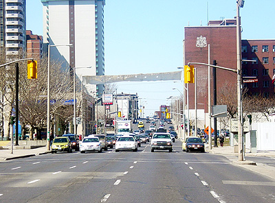
Main Street West near the core has no sense of place - unless you're a driver
The occasional city may get away with schizophrenic architecture (I'm thinking specifically of Las Vegas), but whatever value this mode offers lies in its sheer novelty, the city as theme park. Most real spaces need coherence.
To see an example of simple rules that provide a good framework for development, we can do much worse than Toronto's King-Spadina Secondary Plan. If you've been to the King-Spadina area recently you can attest to its wonderful, eclectic vibrancy.
Translated from plannerese into plain English, the plan is as follows:
That's it. Architecturally, the built environment should be friendly to pedestrians. Functionally, the buildings should have a mix of uses defined by their owners, and public uses should open onto the street, not an internal mall. The latter principle brings people and businesses into close proximity, while the former ensures that the environment doesn't scare people away.
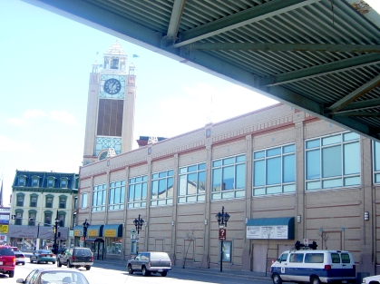
The old Eaton Centre offers only a blank wall to the outside world. Note the tacky, fake flags on the cartoony clock tower
In his book City Comforts, David Sucher distills the principles for developing the built environment into into three rules:
Added to the principle that buildings should be proportional, these simple rules help to create a street wall that gives the street a human scale and makes pedestrians feel comfortable.
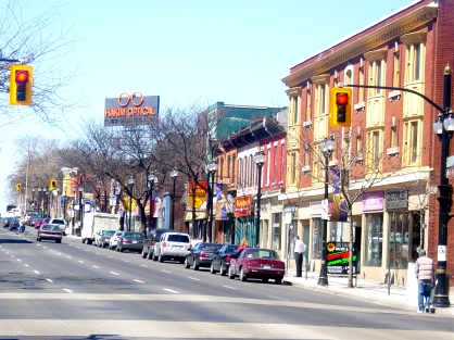
Street Wall on the North side of King St. West, Hamilton
The street is effectively transformed into a great hall, with eye-catching sights along the sides. Pedestrians feel sheltered and safe on streets with good street walls. The street wall draws people's eyes to the available shops and amenities.
Possibly the most beautiful street walls on the planet can be found in Paris (a city, incidentally, that is planning to make its downtown car-free). A recent post on the Skyscraper Page Forum explores Paris in an elegant photo-essay that explains the underlying principles.
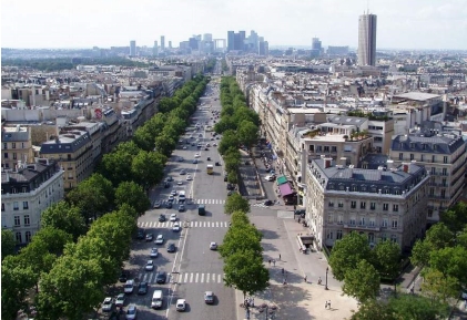
Paris is world famous for its boulevards, framed by Baron Haussmann's streetwalls (photo credit: Skyscraper Page)
Because they are limited to five or six stories and the tops are mansarded (their roofs are steeply double-sloped and include dormer windows for additional accomodation), Paris buildings allow plenty of light and warmth onto the street. "[T]hese facades make continuous, harmonious streetscape out of a similarity (but not identicality!!) of parts; they're particularly adept at defining axes because they meet the sky to make a fairly straight line."
Building walls are richly articulated around windows and trims but still provide a clear sense of scale by delineating each storey. At the street level, the facade is continuous and engaging, with "no unsightly and boring gaps. Such streets are livable, so people live in them."
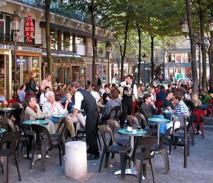
The streets of Paris are alive with people (photo credit: Skyscraper Page)
When architects abandon the scale and balance that makes a welcome streetscape, pedestrians begin to feel out of place.
If buildings are too short, and particularly if parking lots come between the sidewalk and the stores, the street loses definition. A pedestrian on the sidewalk feels isolated and exposed. To get a sense of what I mean, try walking along Upper James. The stores all require huge, garish free-standing signs out front because there are no consistent lines for the eyes to follow.
If buildings are too tall, the hallway effect becomes a tunnel effect, and pedestrians feel crushed under huge walls that stretch up indefinitely, not to mention buffeted by the inevitable wind tunnel. Blank towers with no articulations or textures and no street-level amenities only emphasize this effect further.
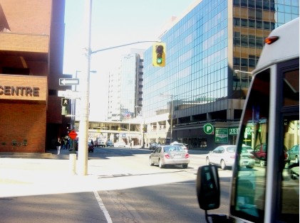
The conglomeration of mismatched buildings on King between James and Bay is just a mess
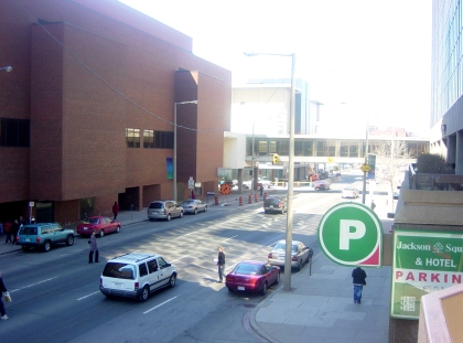
Another view down King St, from the Jackson Square Plaza
If buildings are inconsistent in height (i.e. too short and too tall) or setback (distance from the sidewalk), the hallway effect is destroyed and the street loses coherence. In this case, pedestrians must try to find their way through a giant's collection of hockey trophies.
These simple rules can replace the wads of rigid standards that govern minimum parking requirements, use zoning, lot size, assorted setbacks, minimum street widths, and so on. Heavy-handed micromanagement gives way to organic development.
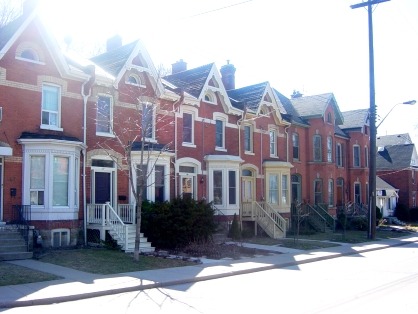
Even residential neighbourhoods benefit from good street walls.
Instead of a nightmare of red tape that only large, well-connected developers can navigate and the bland sameness of huge subdivisions and industrial parks, the city would offer a simple protocol that encourages variety, niche development, and decentralized planning by individual investors.
The built environment that results will celebrate diversity of uses, building types, and lot sizes within a coherent framework that makes people feel welcome, brings diverse people together, and provides real transportation choices.
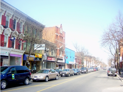
James St. North has the potential to regain its former glory
By rinnesbiz (registered) | Posted None at
Enjoyable article - shades of Jane Jacobs. You might want to add some thoughts on sunshine issues and tax issues which destroy the viability of the streetfront you would promote. The populated Paris scene is deceiving in that it represents a reality we do not have in Canada - astronomical rents/ prices results in tiny quarters for most people which results in a cabin feverish need to "get out". Parking in front is not always a detractor as evidenced by Westdale village but in general your thoughts are valid. Good Luck, Bob
By jason (registered) | Posted None at
Speaking of Westdale, imagine if the parking lots on both sides of the street could be turned into patio/park areas? There is ample room for street parking on the curb lane of King St which right now is never used by traffic. A little bit of Paris right here in Hamilton if we could get rid of those parking lots.
By D'Angleterre (anonymous) | Posted March 19, 2009 at 12:31:00
Even Paris isn't content with status quo.
> > > > >
Sarkozy's daring design dreams for a new 'Grand Paris'
In the first major redesign effort since Napoleon III, teams of architects offer ideas to reignite the City of Light.
By Susan Sachs | Correspondent of The Christian Science Monitor
from the March 19, 2009 edition
Paris - Kings, emperors, generals, and presidents have all tinkered with the city.
It's been walled, razed, and excavated. In the zeal of modernization that seized planners in the 1970s, its skyline was pierced by a single 59-story skyscraper and its boundaries fixed in concrete by an eight-lane beltway.
Paris is once again on the drawing board. Commanded by President Nicolas Sarkozy to reimagine the capital as a "world class city," teams of internationally known architects have come up with 10 strategies for creating a metropolitan area known as Grand Paris – it's the first major redesign since the Napoleonic era.
Their ideas range from the prosaic to the fanciful. But they all say that Paris – its public transit system saturated, its periphery spoiled by ugly housing projects, and its suburbs an undefined sprawl of disconnected towns – does not work.
"It's slowly losing its vitality," says award-winning Paris architect Jean Nouvel. "What we laughingly call regional development is finished. If we want to maintain the prestige of Paris, we have to look after it."
Continued at csmonitor.com/2009/0319/p01s03-wogn.html
By K (anonymous) | Posted April 28, 2010 at 22:33:52
Hello all...
Just happened upon this website recently, and fell in love. Suddenly there are other people matching my weekly rants as I drive through town! I've lived in Burlington since before I was born until a month ago. I'm part of an architectural office in lower Hamilton and now I'm a brand-new Hamiltonian.
I've read numerous articles/blogs on RTH over the last week, and gotta say, there's one recurring thought I see missing. Everyone keeps talking about how you must build up to the sidewalk... I accept that point with a couple of conditions:
- First, not always! If we have nothing but street walls there is no greenspace and no mental break. Even in the heart of a downtown, have a streetwall for a couple blocks, and then set them back (e.g., the City Hall/Cdn Football HoF/Library stretch on Main).
- Second, we must remember SCALE! Hamilton has tons of buildings at the sidewalk, and some of them are scaled so large you miss them entirely. I drove through Hamilton every few days for a couple of years and never noticed some of the landmark buildings (e.g., Civic bldg/various churches). When you build big buildings, you tend to (logically) scale up the details. Well, if you build to the sidewalk, there's no way to see any of it unless you walk around looking up at the sky. What's the point of building to an architectural style if all you see walking around is the foundation wall?
You must be logged in to comment.
There are no upcoming events right now.
Why not post one?