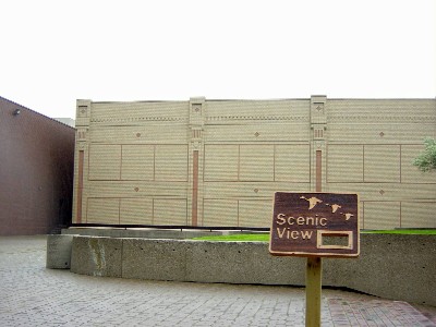
Why anyone ever thought people would rather walk across a boxy roof than down a lively street remains one of the enduring mysteries of the 20th century.
By Ryan McGreal
Published December 14, 2004

In his 1971 book commemorating Hamilton's 125th anniversary, David Proulx bragged that the city was "cutting away the rot of the Victorian age." In its place, he wrote, would go:
the 26-story [sic] Stelco Tower, rising 330 feet, a four-storey banking pavilion, an enclosed shopping concourse, a two-acre landscaped plaza, two movie theatres with a total of 1,200 seats and underground parking for more than 250 cars... followed by ... a major shopping centre, an addition to the shopping concourse, a 24-storey office tower, a 400-500-room hotel, a department store extension, five apartment towers with 800 units, more underground parking and an enlarged plaza.
Added to that will be the city's $10,000,000 theatre-auditorium ... a trade-convention centre, new art gallery, new main library and new farmers' market. Pedestrians will cross over major streets on elevated walk ways, high above the noise and fumes of traffic while most of the projects will be interconnected by underground and concourse level walkways. [empasis added] (David Proulx, Pardon My Lunch Bucket, Corporation of the City of Hamilton, 1971)
Of course, Proulx's shiny future is our grim present. His "two-acre landscaped plaza," this month's featured atrocity, ranks among the ugliest, most un-scenic destinations in Hamilton. There is nothing to see on the Jackson Square Plaza: no compelling architecture, no art, no storefronts, no cafés. Aside from smokers and the occasional free concert, the Plaza is an urban dead zone.
The "Scenic View" sign, placed by artist Liss Platt, is part of the Future Cities project. I activated the sign's audio box fully expecting a tongue-in-cheek drubbing. After my third listen, I still couldn't decide whether Platt seriously considers the Plaza to be a worthy example of postwar design or simply ascribes to a particularly subtle mode of irony.
When I asked, she explained that she was "trying to transform viewer's assumptions about what is 'scenic', and to legitimize (by aligning them with art) the types of 'scenes' offered in Hamilton." That is, she was being both authentic and ironic, trying to reframe a place in order to draw much-needed attention to it.
It certainly drew my attention. Why its designers ever thought people would rather walk across a boxy roof than down a lively street remains one of the enduring mysteries of the 20th century. Whatever legitimate artistic value the Plaza might have, it is architecturally and socially illegitimate, an unwanted bastard child of postwar renewal.
You must be logged in to comment.
There are no upcoming events right now.
Why not post one?