Buildings that turn inward and isolate the street and its inhabitants are often blamed for destroying streetlife.
By Trey Shaughnessy
Published January 10, 2007

Photo taken Jan 2, 2007
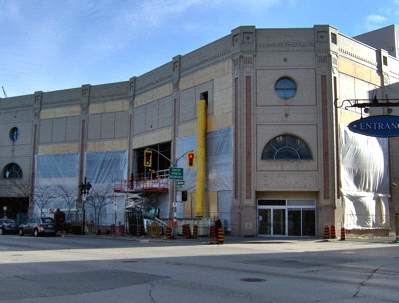
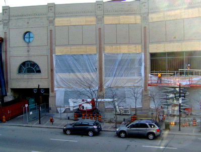
The planned renovations to Hamilton City Centre are underway.
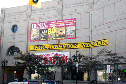
The gigantic blank wall that faces York and McNab ignores the street. That type of architectural design feature, dominant in Brutalism, was already far out of fashion when the Eaton Centre was built in 1989.
Brutalism was known for creating vast, unfinished or 'raw' concrete facades and for obscuring entrances.
The City Centre wall was made from brick at a time when post-modernism was the design style of choice for architects, which usually featured large glass curtains and unique angles, like the nearby CIBC towers.
Buildings that turn inward and isolate the street and its inhabitants are often blamed for destroying streetlife in downtown and in cities across North America.
Streetlife is essential for safety, shopping, patronizing and plain-old socializing. Without it, city streets are desolate and frightening.

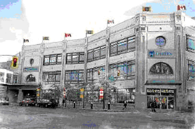
Rendering from Hamilton Spectator, Aug 2, 2006
The City Centre is finally having holes opened in the blank wall for some nice big windows.
The original wall always looked like its windows were bricked up, which leads me to believe it was originally designed for windows and cost savings determined otherwise. It looks now like it should have had windows between the pilasters.

This is where 500 municipal workers will be located during the renovations to City Hall. The temporary location is expected to last two and half years for 400 of those employees.
I would suspect that Fercan Developments is hoping the remaining 100 workers will be permanent.

500 municipal employees will locate here during City Hall renovations
By Ted Mitchell (registered) | Posted January 10, 2007 at 11:50:15
I would not call the current HCC style "brutalism". How about "ugly" ?
One of the most beautiful buildings in Hamilton is the Hunter St. GO station. The "charm" (ok, ok) about Brutalism is that form and function intersect. Where else has that happened before or since?
I once read "Ontarians never met a style of architecture they did not embrace" (meaning they tend to mix them together to make a sort of ugly chimera.)
What really matters are the width of the sidewalks and the opportunities for pedestrian street life and economic health.
By jason (registered) | Posted January 10, 2007 at 11:53:01
you're right Ted. they really should have put a space or two along this York St sidewalk for restaurant or cafe with rollback windows and patios....it's one of the few spots in the entire city with very wide sidewalks...and it's right at the main market entrance. Go check out the number of people coming and going at this intersection each day the market is open. A street cafe would have been great. At least they're popping in windows. Street life will hopefully come sooner than later.
By schmadrian (registered) | Posted January 10, 2007 at 13:10:07
Sometimes I think Hamilton would make for a great 'How Things Turn Out Badly...Sometimes Not Even From 'Bad' Decisions, But From No Decisions At All' treatise.
I think it's hilarious that this intersection is at the barrel-end of York Boulevard, itself a one-way cannon firing...well, evidently, nowhere.
And to think, it wasn't always this way. Oh, to have The Savoy back in that neighbourhood again...
By highwater (registered) | Posted January 10, 2007 at 15:51:22
Ted,
I don't think Trevor was suggesting that the HCC is Brutalist, rather that it is Post-Modernist with a distressing Brutalist 'blank wall' hangover. Also, I'm a bit confused about your reference to the GO station. It sounded like you were referring to it as Brutalist, but I'm sure you know that it comes from the earlier, Art Deco/Art Moderne period.
Ryan, "cartoonalism" is a very apt description for Post-Modernism- a perfect architectural style for the '80's which has left a blight of Disneyfied public and commercial architecture across North America. It was all supposed to be very ironic and self-referential, but out of it's narrow '80's context, just ended up looking fake. Good riddance.
By jason (registered) | Posted January 10, 2007 at 16:01:11
go check out some of the areas in downtown Oakville for a local 'Disney' experience. All those shiny, empty walls would look a whole lot better with some grafitti murals and bird crap.
You must be logged in to comment.
There are no upcoming events right now.
Why not post one?