Despite poor decision making during the renovation, I must admit that I felt a sense of pride walking back into this fabulous building.
By Jason Leach
Published May 29, 2010
Yesterday I had the chance to head into the newly renovated City Hall. While much has justifiably been made of the poor decision-making during the renovation process, I must admit that I felt a sense of pride walking back into this fabulous building despite its sidewalk cladding.
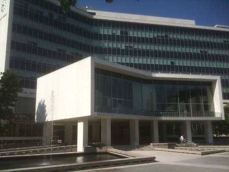
Hamilton City Hall
It's a gem of a building. I recall saying, out of frustration, that I wish they'd just knocked it down instead of butchering it. Truth is, I'm glad we have it and I'm glad we'll have it for decades to come.
Perhaps hunks of concrete will start falling from its exterior, allowing a future Council to do the right thing and put limestone or marble back on, but for today, some positive reviews.
I was unable to snap any interior pics due to time restraints, but was pleased to see all original marble desks and Italian mosaic tiles restored and looking great. The overall cleanliness and freshness of everything was very noticeable. Heck, the sliding doors actually opened when you stepped toward them. Who knew it was possible?
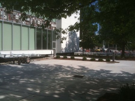
Italian mosaic tiles
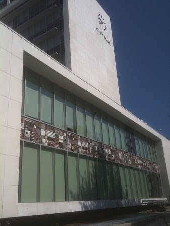
West side view: tiles and clock
Without getting into a rant about why Main Street stinks, I must say that I'm pleased - not thrilled - with the finished forecourt. As previously stated on RTH, I would have preferred a piazza type of development very welcoming and usable by the public.
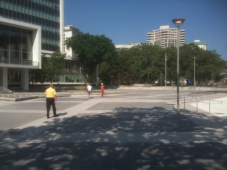
Forecourt
However, the space that has been renovated is very suitable for public gatherings and if Main Street ever becomes a normal downtown street, the forecourt could be a great space for large markets, music and events.
I'm pleased to see the fountains and water pools back out front with the concrete lip around them perfect for a place to sit (although the lack of shade makes it quite toasty in weather like this).
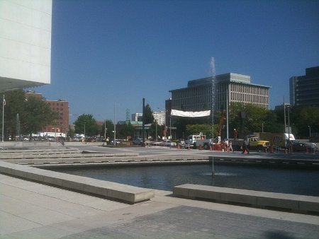
Fountains
The overall redevelopment of the interlocking brick and newly poured concrete makes the forecourt more enjoyable and the cafe patio (can I call Country Style a cafe?) is very nicely situated on the eastern side of the building surrounded by gardens and trees.
My favourite view of City Hall has always been the back, and still is. I love the glass and the angles and the angled steel handrails. The artsy concrete holes remain, along with the mature trees and gardens out back.
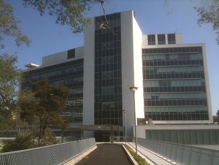
Rear view: glass and angles
Finally, I still find it a great experience to step out the front door of City Hall and catch the view of the Board of Education, Hamilton Place and the Art Gallery of Hamilton across the street.
The potential for a vast civic square surrounded by unique modern architecture is still possible, despite close calls in recent years threatening demolition of both City Hall and the Board of Ed building.
Perhaps LRT, two-way conversion and a reconstruction of the Board of Ed/AGH Main St frontage will give us the Civic Square our great city deserves.
By JeffTessier (anonymous) | Posted May 29, 2010 at 23:11:00
I was in there yesterday to pay a parking ticket. It was at least clean, and looked fresh and sparkly, which I guess is to be expected given what's been done. I think the word I would use is "updated" - many older features retained, but given a good scrub and looking somehow new.
The counters at the "Service Centre" or whatever they call it now - is that marble, or faux marble? And were they always like that, does anyone know?
The building always had a lot going for it in terms of style - all the renovation committee had to do was not screw up what they inherited. And where they didn't screw it up, it looks better than ever!
Look for a photo of the renovated City Hall on the cover of the upcoming H Magazine. Although, there is a twist.
By woody10 (registered) | Posted May 30, 2010 at 00:52:49
Can they turn that fountain into an ice rink in the winter? I always thought that would have been a great idea for drawing people downtown in the winter, just like T O city hall. Have some venders with hot chocolate and coffee. It's the little things that make a city a community.
It looks better than I expected.
Walking by, I thought the scale and design of the fountains is pretty lame, though. They could be much larger (edit: wider in diameter) and look more impressive without splashing onto the sides.
I like the vendors idea -- how about a street meat vendor ANYWHERE in the downtown besides Street Meat BBQ in a storefront? I see one at a Jackson Square entrance sometimes, but never in Gore Park or at other locations it would make sense to have one.
Comment edited by Meredith on 2010-05-30 00:33:41
By crhayes (registered) - website | Posted May 30, 2010 at 01:38:23
I think the forecourt is pretty lackluster. Having only one nozzle spraying water in each fountain looks lame IMO - it looks kinda cheap. Overall the forecourt just looks barren. I will have to take a tour of the inside soon though, from the early pictures it looked really nice.
By Critic (anonymous) | Posted May 30, 2010 at 08:29:43
I don't know, it just doesn't seem to have the "Wow!" factor!
By jason (registered) | Posted May 30, 2010 at 09:09:03
I'm having a heck of a time digging up a photo of the original fountains, but I think they had some design to them and not just a straight shot in the air. I'm assuming (hoping) that they haven't finished the fountains yet.
Heck, in nice weather like this I'd like them to have a dozen NICE table/chair/umbrella sets out on the forecourt so people can eat their lunch and enjoy the weather without being scorched. It's a small step, but one that would at least animate the forecourt a little.
I don't remember for sure, but in looking at my photos I see all these window blinds. Were they there in the old building?? I hope they are open at night. One of the great city hall views you'll ever see is from the AGH sculpture atrium looking directly at city hall with it's lights on at night. It's very impressive.
And in case, anyone notices or cares, the third photo is actually the east side wall view.
By jason (registered) | Posted May 30, 2010 at 09:12:34
Here's the only photo I can find of the old fountains.
http://www.google.ca/imgres?imgurl=http:...
Still not overly impressive, but better than a single invisible jet. Considering the forecourt was put back to it's original condition, let's assume that will include the fountains as well. I have some historic Hamilton books I'll nose through and try to find a 1960 photo of city hall and see what the fountains were doing then.
By JeffTessier (anonymous) | Posted May 30, 2010 at 09:52:57
I'm interested in those fountains too, as I think those two single jets look absolutely ridiculous in front of a building that is so imposing both in its look and its significance.
In general, there seems to be a lot lacking in the area in front of City Hall. The fountains and how weak that looks. And the lack of any sort of structure to break up the space. Something to at least create shade and texture - that space is like an oven when the sun is hitting it.
By crhayes (registered) - website | Posted May 30, 2010 at 13:10:05
I agree with the above comments.
The forecourt is clean and refreshed which is a good thing. It has potential if it is used in creative ways - for festivals or including tables/chairs/umbrellas like was previously mentioned. I just fear that it won't be used this way and it will remain barren and boring.
By Desmond (anonymous) | Posted May 30, 2010 at 14:35:41
Colossal mistake.
They spent 90+million for a building that is too small and does not accomodate all employees and then decided to spend another 120+ million on the lister block.
They could have knocked it down and built new with a skating rink, parking, and whatever else the heart desires for the same price and have all employees under the same roof.
When you have people making million dollar decisions that you wouldnt trust to make hundred dollar decisions you get what you deserve.
By jason (registered) | Posted May 30, 2010 at 15:49:11
They could have knocked it down
no kidding. Hamilton seems to have more demolition companies than development companies. Personally, I'm glad we decided not to knock something down for once. Especially a gem like this. Once it's gone and replaced with a crappy modern box, it's never coming back.
By TnT (registered) | Posted May 30, 2010 at 19:34:07
I think it is a compromise candidate. Maybe my memory is faulty, but I recall the plans for the city hall rebuild were on a much larger scale. There were going to be green roofs, solar panels and an extended center tower. What happened?
By jason (registered) | Posted May 30, 2010 at 21:50:03
found a sweet pic of city hall
http://www.thecanadianencyclopedia.com/i...
click on a photo and scroll to photo number 10.
I love the fountains lit up. Also, you can see why I made my earlier comment about the night view with the interior lights on. The place looks great.
By woody10 (registered) | Posted May 31, 2010 at 00:33:01
Nice pics, the pic of Dofasco is reversed though. Figures.
By nobrainer (registered) | Posted May 31, 2010 at 09:13:20
@Jason I respect you trying to make Lemon Aid out of the city hall reno. If only the Forces of Darkness were this reasonable when they don't get there way...
By nobrainer (registered) | Posted May 31, 2010 at 09:14:46
@Critic Not long ago I saw a drainage ditch in Ancaster that made me go "WOW".
By Henry and Joe (anonymous) | Posted May 31, 2010 at 13:01:07
I was in myself last week to pay a parking ticket. In perverse way, I rather enjoyed the experience. It was a culmination of pride I started to feel when it was lit up in the backdrop of the EcoArts festival at the AGH. It was nice to walk through this building again. The concrete slabs in the back looked a bit off in some places, but overall I think it is a pretty good reno. I thought the pre-cast was going to look horrible, but its actually kind of nice. I wanted marble personally, but I can live with this.
By UrbanRenaissance (registered) | Posted May 31, 2010 at 13:52:04
I wanted marble personally, but I can live with this.
Seconded. Now if only the city can manage to keep the facade clean and in good repair we won't have to go through this all again in 10 years.
By oldcoote (registered) | Posted May 31, 2010 at 16:53:52
I was through today.
The forecourt is depressing. Just so barren and ... new. A few mature trees out front might have been nice. Might serve to hide some concrete as well.
The inside is pleasant enough. I didn't see a huge difference frankly. I expected more in my brief visit.
By jason (registered) | Posted May 31, 2010 at 20:05:16
considering how unique this building is, I can't believe the lack of online resources about it. I can't find any pics other than the odd one from recent years about the building.
By Half Full or Empty? (anonymous) | Posted June 01, 2010 at 12:01:28
I like the old building, and have been frustrated by the current reno more by the pattern of decision-making that it revealed than the results. Generally, this city's few WOW factors are more the result of fortuitous accidents, or sometimes by the dedicated work of a few who toil without drawing the attentions of local bureaucrats and policy makers. Our West Harbour trails began as tainted landfill, for instance. Our abundant waterfalls are the result of local geography overcoming constructed efforts to divert them into sewers. Historically we are afraid to risk the expense and political currency on WOW enterprises. What if the decision proves wrong? How will we pay for the WOW? Better to be safe, make decisions time-tested in our own communities and others. Even if the project doesn't live up to expectations (Red Hill Valley Expressway) it will get enough use to justify in hindsight. Better to preserve our municipal potential than to exploit it.
City Hall forecourt, when originally constructed, was to bridge to the AGH court on the north side, which was to bridge to Jackson Square's upper deck, but only one bridge was ever built (and it is seldom open) due to familiar demands to economize. Better to have city council meet in Bell Tel's underground communications vault at Bay & Main than give those fancy political types with their grandiose visions an expensive canvas to display their skills.
Anyway, there's still potential to build a WOW location on Main St. if the fore-and-aft courts of city hall & the AGH are viewed as one, enhancing the sculpture courts with dancing lights and waters, and without a six-lane expressway running through the middle. And the Jackson Square upper deck is STILL a great festival and performance location. Oh yes, Hamilton still has its precious "potential."
By Tybalt (registered) | Posted June 01, 2010 at 13:32:46
"I recall saying, out of frustration, that I wish they'd just knocked it down instead of butchering it. Truth is, I'm glad we have it and I'm glad we'll have it for decades to come."
I am glad too. City Hall is at the traditional low point in its lifecycle in terms of public perception of buildings. In 15-20 years the architecture of the period will begin to acquire the aura of a classic building - and then we will be very glad we have it.
"Now if only the city can manage to keep the facade clean and in good repair we won't have to go through this all again in 10 years."
YES UrbRen, this is absolutely the key. Concrete is susceptible (much more than marble) to sucking up dirt, grime, rust streaks and other mess that makes concrete buildings look filthy and depressing. It will be absolutely key with the concrete to make sure it stays clean and that cracks and holes (which concrete is also more prone to than stone) are repaired on a constant basis.
By jason (registered) | Posted June 01, 2010 at 21:53:44
Concrete is susceptible (much more than marble) to sucking up dirt, grime, rust streaks and other mess that makes concrete buildings look filthy and depressing.
Well, at least one advantage is the fact that this building is located here in Hamilton with pristine, clean air and it's locale doesn't have any big highways out front with lots of car and truck fumes belching everywhere. It should be a breeze to keep clean.
Anyway, there's still potential to build a WOW location on Main St. if the fore-and-aft courts of city hall & the AGH are viewed as one, enhancing the sculpture courts with dancing lights and waters, and without a six-lane expressway running through the middle.
So true. someday....someday....
By Jason (registered) | Posted June 01, 2010 at 23:11:12
Just saw the hall at night for the first time. Looks really good. All exterior lights work and the entire building looks pretty amazing. Other buildings in Hamilton should take a cue from the hall and do some exterior lighting too. Just don't slather them in sidewalk.
Comment edited by Jason on 2010-06-01 22:12:12
By ownbfjyj (anonymous) | Posted July 10, 2014 at 13:43:20
carpet cleaning Los Angeles carpet cleaning Los Angeles water damage Santa Monica yelp.com/biz/xtra-clean-of-santa-monica-santa-monica-2
You must be logged in to comment.
There are no upcoming events right now.
Why not post one?