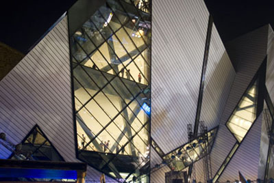
We went to the beloved Royal Ontario Museum today. In addition to its many standard attractions, we had a chance to see the new entrance and addition, called the Michael Lee Chin Crystal.
It's as if the original building stepped into a matter transportation pod without realizing a space ship had accompanied it, and they came out the other pod fused together into a monstrous hybrid.
While the original neoclassical building evokes a fitting sense of awe for the pressing weight of natural and human history, the new entrance, named for its prime benefactor and designed by uber-architect Daniel Libeskind, seems instead to say, "Hey, look at me - I'm a megalomaniac!"
Where to begin with this atrocity?
First, aside from the garish angles and points, it doesn't actually resemble crystal or even glass. The aluminum cladding overpowers whatever vaguely crystalline sense the structure might otherwise possess.

The Michael Lee Chin Crystal at night (Image Credit: Royal Ontario Museum)
Brand new, it already looks tawdry at anything closer than helicoptor's-eye-view. I suspect it's going to age and weather like a heroin addict.
Worse, the facade looms out of the pavement at an oppressive angle and actually hangs over anyone who approaches the front entrance, producing the unpleasant sensation that it's about to topple.
Is it too much to ask that urban architecture - even the iconic variety - be designed in such a way as to make pedestrians feel comfortable? I know art is supposed to challenge the viewer, but there's a difference between 'emotionally harrowing' and 'imminent catastrophe'.
Speaking of icons, the Crystal doesn't have any. Instead, it is an icon in itself, a giant, freestanding ornament that could just as easily fit in the middle of a desert - or a huge surface parking lot.
In other words, it makes no attempt whatsoever to interact with or otherwise accommodate its surroundings. It juts out of the original ROM like a rare, geometric tumour or a science experiment gone horribly awry.
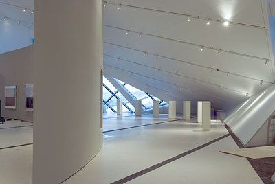
With such a deliberately awkward design, it shouldn't come as a surprise that the interior space is similarly difficult to use sensibly. The weird angles and abrupt points result in a lot of wasted spaces and clumsy shapes that fight against functional usage.

The Crystal interior, presumably intended to be 'edgy' (Image Credit: Archiseek)
A cynical, meanspirited part of me wonders whether Libeskind and his super-starchitect peers aren't just out to see what they can get away with - whether they actually take their own designs seriously or are just having a multi-million dollar lark at the public's expense.
Then again, my twelve-year-old son absolutely loved it, so maybe I'm just an old crank. Still, I can't get images of Jeff Goldblum out of my head.
Be afraid. Be very afraid.
(with regards to Jim Kunstler's Eyesore of the Month)
By A Robot (anonymous) | Posted August 17, 2007 at 00:27:26
It's structure is an engineering masterpiece, and it was made right here in Hamilton.
By A. Observer (anonymous) | Posted August 17, 2007 at 09:47:26
For every person who dislikes a cutting edge building there's a another person who'll find the same building an architectual masterpiece. I guess that's part of the reason we call them cutting edge. In terms of music and theatre Toronto is the cultural capital of Canada, and truly rivals the so called world class cities of the planet. Where it has lagged for years is architecture. Fortunately Libeskind and a few other creative architects are beginning to bring to Toronto contemporary forms of design that have long been part of the evolution of cities like Chicago, London, and Paris. The Crystal is not something we're accustomed to seeing in this country, but over time people will better appreciate it, as they did for Toronto's current City Hall.
By peter (anonymous) | Posted August 17, 2007 at 11:00:00
in my humble opinion it looks a little cheap. naturally, it was far from it but there you go. it's good that toronto wants to up the architectural ante, as it were, but it does look frightening. add to that it's poor functionability and we've got a problem. anyway, let's give it ten years and reassess this...this thing.
By highwater (registered) | Posted August 17, 2007 at 14:49:00
Fear not, Ryan. This too shall pass. I have no doubt that we will see the demolition of this monstrosity in our lifetimes. As Lisa Rochon pointed out in her hilarious take down, every generation feels the need to reconfigure their big institutions, if only so they can poke fun at the fashions that went before.
Too bad Vanbots' remarkable engineering feat was accomplished at the expense of the gracious original buildings, one of the more notable achievements of another local company, Pigott Construction.
By jason (registered) | Posted August 17, 2007 at 20:48:37
just returned from a trip to NYC. Toronto is nowhere near the same level of culture, A&E and 'world classness' of New York and I would presume, London, Paris and the others. Toronto is trying to hard and the result is junk like this. Just be Toronto. You'll never be New York and that's fine. Be the best TO you can be without ruining such good public spaces (ahem, Dundas Square).
By JayTO (anonymous) | Posted August 20, 2007 at 14:19:56
Had the "pleasure" of visiting yesterday. It is a horrid building. I agree, it hurt our brains too, and all felt it would be demolished during our lives. It is shoddily constructed, the fit and finish is horrible! There are gaps and crooked gratings, the place is filthy. We wondered why they bothered with the stairway of wonder.
90% of the space is still closed yet they have the gall to charge $20 for admission. The updated galleries in the 1914 building are a gem however, the old building still shines.
Don't get me wrong, I LIKE modern buildings, done right. The Four Seasons Centre is a great example of done right.
This crystal is a ginormous monstrosity of wrong. Someone should be sued for this load of junk.
By Captain Allbran (anonymous) | Posted August 31, 2007 at 03:45:46
I thought they canceled Star Trek? It's nice to know the Enterprise was recycled.
By Micheal Lee Chin (anonymous) | Posted January 17, 2008 at 17:30:38
I would just love to see what your thoughtless piece of shit mind could come up with. If your going to cut up something at least make ur vocabulary makes sense.
By erik van (anonymous) | Posted March 23, 2008 at 14:30:19
As with furniture, great new buildings are always welcome, we need these public places to confirm our participation in the human condition.
However, in buildings and furniture, it's always a mistake to confuse "new" "exciting" and "cutting edge " with "worthwhile", "beautiful" and "usable".
This building in my opinion is an example of the personality cult gone wrong - buildings are meant above all to be used, and the ROM crystal uses very poorly indeed.
Surely when entering a great public building the user should feel a sense of awe and expectation, a hopeful excitement about this expression of the best of human endeavour - in this case, it feels like one is entering a fairly large public washroom, it is oppressive, shoddy, and makes one want nothing more than to get out of the lobby.
Once inside the feeling doesn't change much, except upon entering the revamped spaces of the original building.
As a critical exercise, it's great to enter the Crystal, (pay the ouch, 20 bucks) get the lobby feeling, then head straight to the original entrance, and pretend to enter the building again. The contrast in those 2 experiences is all that's required to make up one's mind.
Yes, we desperately need new architecture, but only if it's better than the old.
By Jim (anonymous) | Posted January 02, 2010 at 18:42:57
I think that from the outside... purely as a piece of sculpture... it's breathtaking. Spectacular. However, when I entered I found it to be rather cold. The resulting spaced inside are very awkward. And the fit and finish is disastrous. The metal panels all over the stairs are a mess. The gaps are all messy. Thing are crooked. The walls are just cheap drywall. The materials are so cheap and ugly. And the spaces are awkward. Walls tilt in towards you. Worst of all are the bridges to nowhere in the 'sprit room'. Wow. That's just unreal. You'd think the architect would reassess when you ended up with a walkway that leads to a dead end?!?! And I love how you can see right down into the messy coat check from above. The interior was not thought out at all. Cool from the outside. But really not at all functional, inspiring or comfortable on the inside. Such a shame.
You must be logged in to comment.
There are no upcoming events right now.
Why not post one?